Battlenet Mobile App
Battle.net is a mobile app for Blizzard Entertainment where users can stay connected with their online friends.
Overview
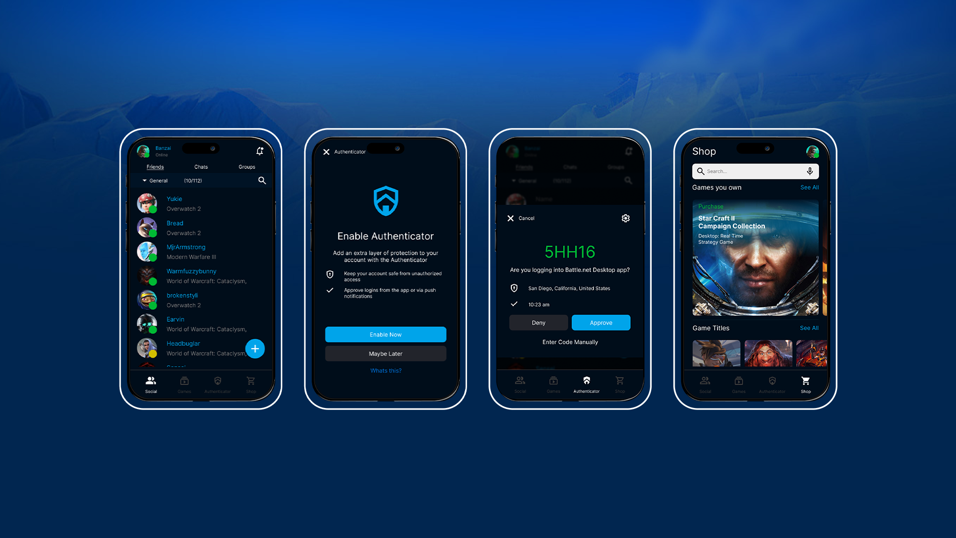
The Battle.net mobile app, developed by Blizzard Entertainment, keeps users connected with their online friends. It allows gamers to chat, purchase additional game content, and enhance account security with a two-factor authenticator.
Challenge
The challenge in reconstructing and reorganizing the mobile app lies in ensuring the new design aligns with the established brand identity—enhancing the user experience without disrupting Blizzard Entertainment’s core identity. Another key challenge I encountered was collecting user interviews and interaction data to ensure the redesign effectively improves user experience, increases engagement, and seamlessly drives traffic and revenue.

Objective
Interaction: Create and reposition the Two Factor Authenticator feature to ensure it is a central component that users can easily find and access.
Social Usability: Create a notification feature and a friend category system. the category system will help organize friends into specific groups for easier access, while the notification system will allow users to view notifications, accept game invites, friend requests, and group invites directly within the app.
Organization: Reorganize, restructure, and develop a system that identifies games owned by the user and delivers targeted content specific to each game.
Vision: Structure and organize the current app to better the user experience for gamers.
With competitors like Steam, Discord, and Slack, many gamers aren’t fully utilizing Blizzard’s Battle.net mobile app. To position it as a primary interaction tool, the app needs to be more appealing with constant updates. I believe the main challenges stem from its organization, social usability, and overall interaction experience.
Tools
Figma
Sketch
Adobe Illustrator
My Role
AJ Moreno – UI/UX Designer
Timeline
8 weeks
Process
Research
User Personas
Problems & Solutions
Ideation
Design
Reflection
Researching the problem space
This case study used three user personas in the target demographic over virtual interview and interaction of the mobile app. They were asked to run through a few tasks on the mobile app as well as being interviewed on who they are as customers and as a users of online applications. Users were asked to perform tasks and share screens on Discord while navigating the mobile app via screen share and voice chat.
User interview
What are the most common communication applications you use on your phone?
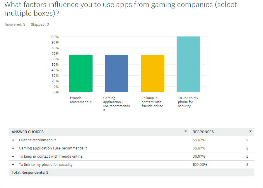
What factors influence you to use apps from gaming companies?
Do you use two factor authenticators for your gaming accounts?
Do you play games more on: Console, mobile, or pc?
Do you actively shop for more content on the games you play?
What’s the main reason for using the gaming mobile apps?
User tasks
• Users were told to open the battlenet mobile app and navigate to the application to discover what is provided.
• After exploring the mobile app, navigate to the two factor authenticator, enable it and approve the code.
• Users were told to find a friend they would want to play a game with and send them a message to see if they can play today.
• Afterwards, users are told to locate the shop page open it and navigate to the game of their choosing.
• Once in the game shop see what that game has to offer for additional content.
• Lastly, navigating back to the homepage see if they have notifications and then once that’s complete log off.
Who are the Users?
For this study, I interviewed three different users who are
26-35
Users ranged from casual gamer, daily active gamer, and a dedicated entrenched gamer (participates in tournaments and events)
Occupations: college student - full time worker
They all play some type of Blizzard game
West Coast and East Coast users
Case Study
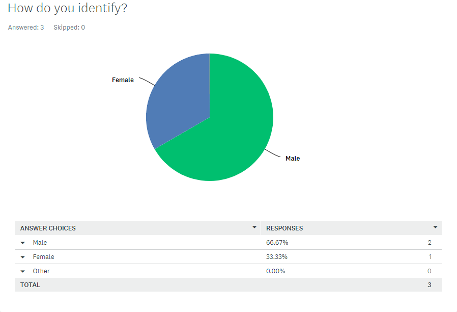
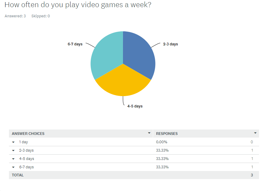
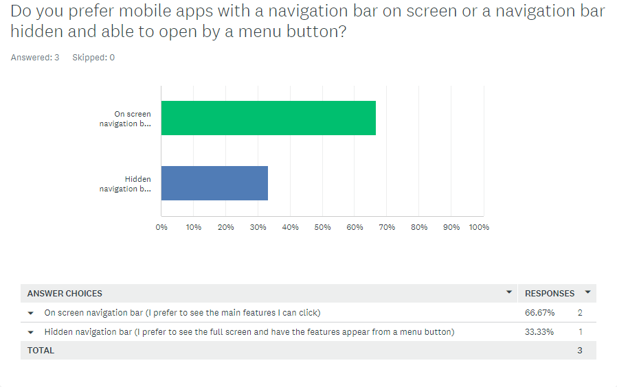
After my initial user interview, to track the research I conducted a survey called “Mobile Gaming Software Survey”. The survey consisted of a total of 10 questions, with 3 participants that fell under the target audience between the ages of 26 - 35. The users were primarily gamers that ranged from, using gaming mobile apps daily, casual users, users that don’t necessarily utilize gaming mobile apps.
Survey: Mobile Gaming Software Survey




User Personas
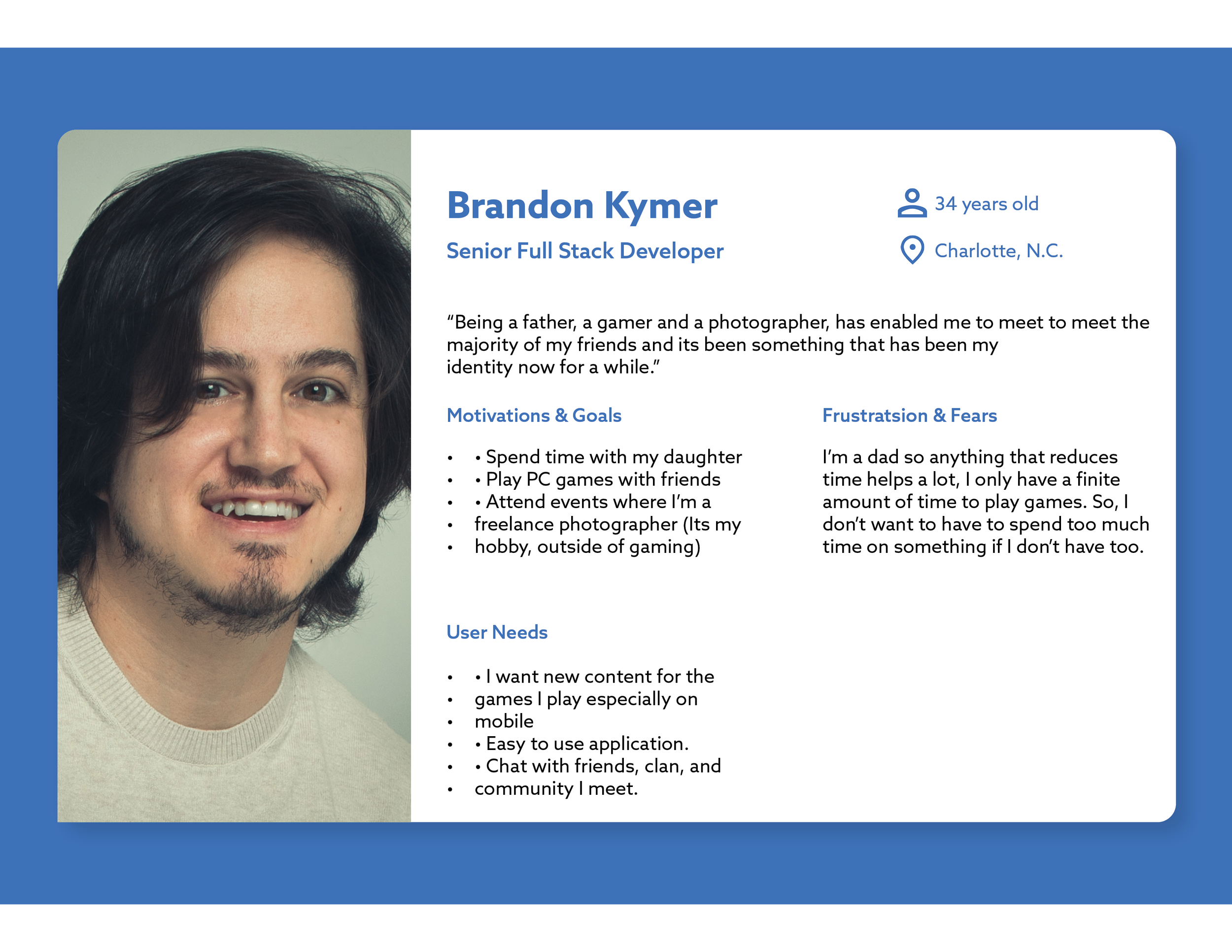
From my research, I developed 3 personas to represent the gaming users. These three users participated in the survey during the first weeks of research gathering and represented the user case. By focusing on users that were primarily gamers, it allowed me to acquire accurate data that leant into creating something that was tailored the user experience of gamers. The three users are my brother and two friends that I game with almost every day, and they were willingly to assist in the user research survey.


Problems & Solutions
Problem 1
Interaction
A primary interactive feature for the app, the authenticator, is inconveniently placed in the profile dropdown menu. Since one of the main reason users download the app to use its authenticator for the security of their accounts, it seems counter intuitive to have the authenticator hidden away in the profile pull down menu.
Findings
When users navigated around the application looking for the authenticator, the primary questions for 2 of the users was “where is the authenticator?” and “is it in the profile page?”
Users took several seconds looking for the authenticator, but eventually found the authenticator in the profile page. During the user interaction of the mobile app, one user asked “why dont they have the authenticator on the front page? Or on the bottom menu buttons?”

Solution 1
Interaction
To solve the problem with the authenticator being difficult to find, it should be positioned at the bottom of the menu bar as a main feature. This would provide a main component that users are looking for, this would enhance the user experience.

The Authenticator is now located at the bottom of the application for quick access and a better user experience for the user. This is one of the primary usages for the Blizzard Battlenet app according to user research.
Problem 2
Social Usability
For the social usability problem, the platform lacks a notification center to alert users of suspicious activities, updates, promotions, events, and system statuses. While SMS notifications are currently used, integrating a notification within the app, with options to opt-in or out is currently missing to improve communication and security for users. It also falls short in friend management. Since Battle net is a social app, not having a way to organize or create those categories in mobile takes away an important feature of connectivity.
Findings
When users were asked to find a friend they wanted to play, and message them to play later on, allthree users started to doom scroll.
One user even stated, “I’m not sure if my friend is even on battle net anymore, I think they might have just deleted their account because I cant find them.” He soon went to the search bar at the top right to look up their name where he found them.
When users were ask to find if they have any new notifications, all three asked “Does Battlenet even have notifications?”

Solution 2
Social Usability
A company that does this successfully is Riot Games, their approach with League of Legends is an example to lean on. Users can categorize friends, making it easier to connect with specific groups you usually interact with. This feature could alleviate problems such as navigating through long friend lists or identifying friends who have changed their usernames. A notification system being added to the top right can let users know they have new alerts to interact with, causing more interactivity with the app.

With the presentation of categories, users can then drag and drop gamers of their choosing into that category

Notification systems are added to the top right which now allows in real time interaction with friends on the mobile app.
Problem 3
Organization
The organization of the Shop could be streamlined more effectively. Currently, users are greeted with a confusing mix of promotions from games they may or may not play, recommendations that aren’t tailored to the user and deals from various games with no clear-cut feature to identify the game you are looking for.
Findings
Users were tasked with navigating to the shop, browse around, find the game of their liking and shop for the content they’d like. All three users were immediately put off from the information that was provided, with one user venting their frustrating saying “I’m not going to attempt this, does it track the games I own? I don’t own call of duty why is it recommending me call of duty?”
All three users scrolled through the application to find the games of their choosing and became sidetracked looking at other content, this could result in a pain point where users end up not purchasing what they were setting out to buy.
Most of the users became frustrated with trying to find the content of the game they were looking for and all three users went to the search bar to type in the game they were looking for. This is a pain point as well, as users are spending more time looking for the for the game they want to purchase content from.
Solution 3
Organization
A clear layout would have to be implemented by keeping the search bar and promo banner at the top and building a user tailored game specific card design below, directing users effectively to their interest, potentially increasing sales and reducing user exit rates.

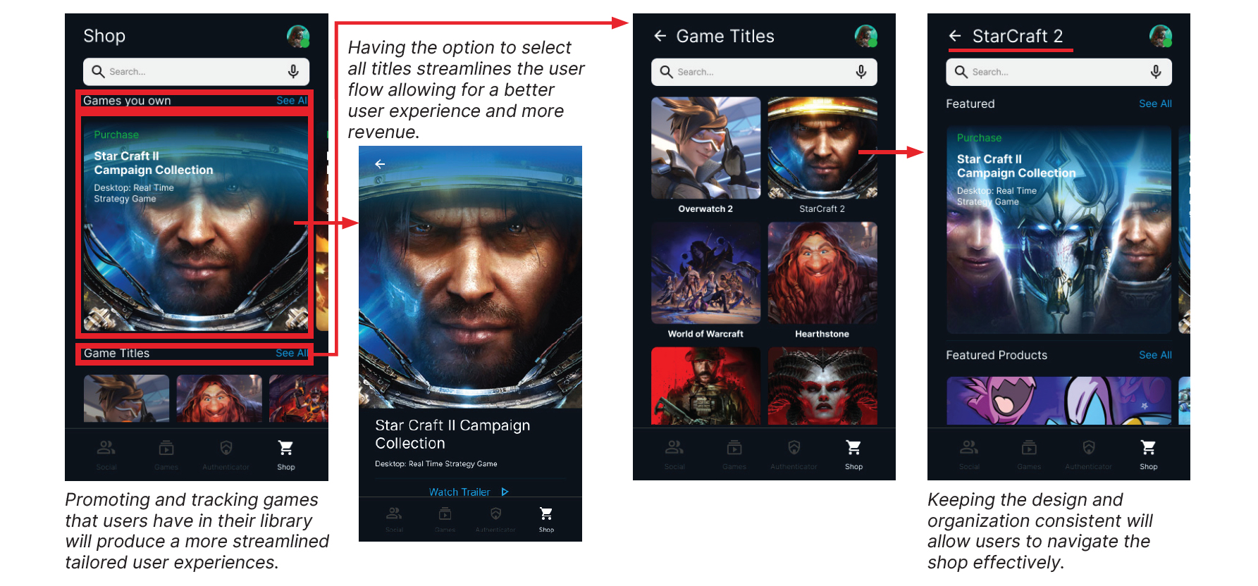
The new design allows content to be found much faster and easier. The search bar is still present but now it allows users to use speech to search for content as well.
Ideation
Low Fideltity Wireframes
I designed a few initial wireframes in Figma and Sketch to brainstorm the most logical layout and effective user interfaces with this project. The goals was to design the user interface by recreating the established social page and enhancing new organization features, shopping page layout, and notification system. Throughout the project, I tested out new ideas and incorporated feedback given back.
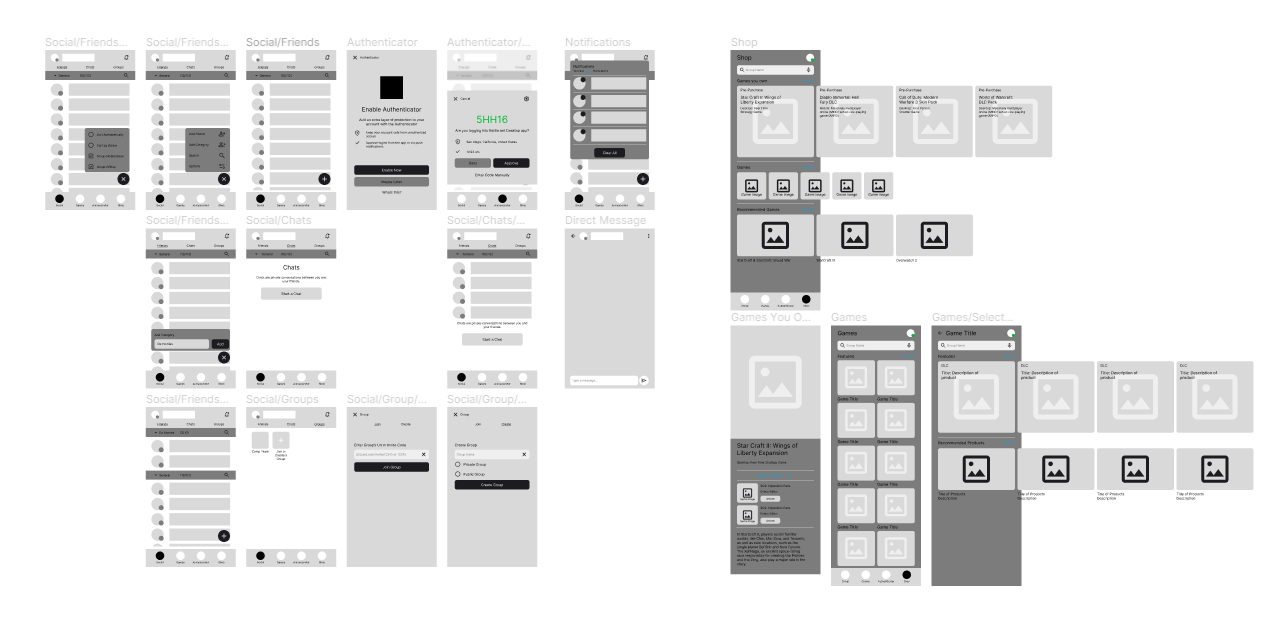
Sketches showing the user flows - interactions, challenges, and layout
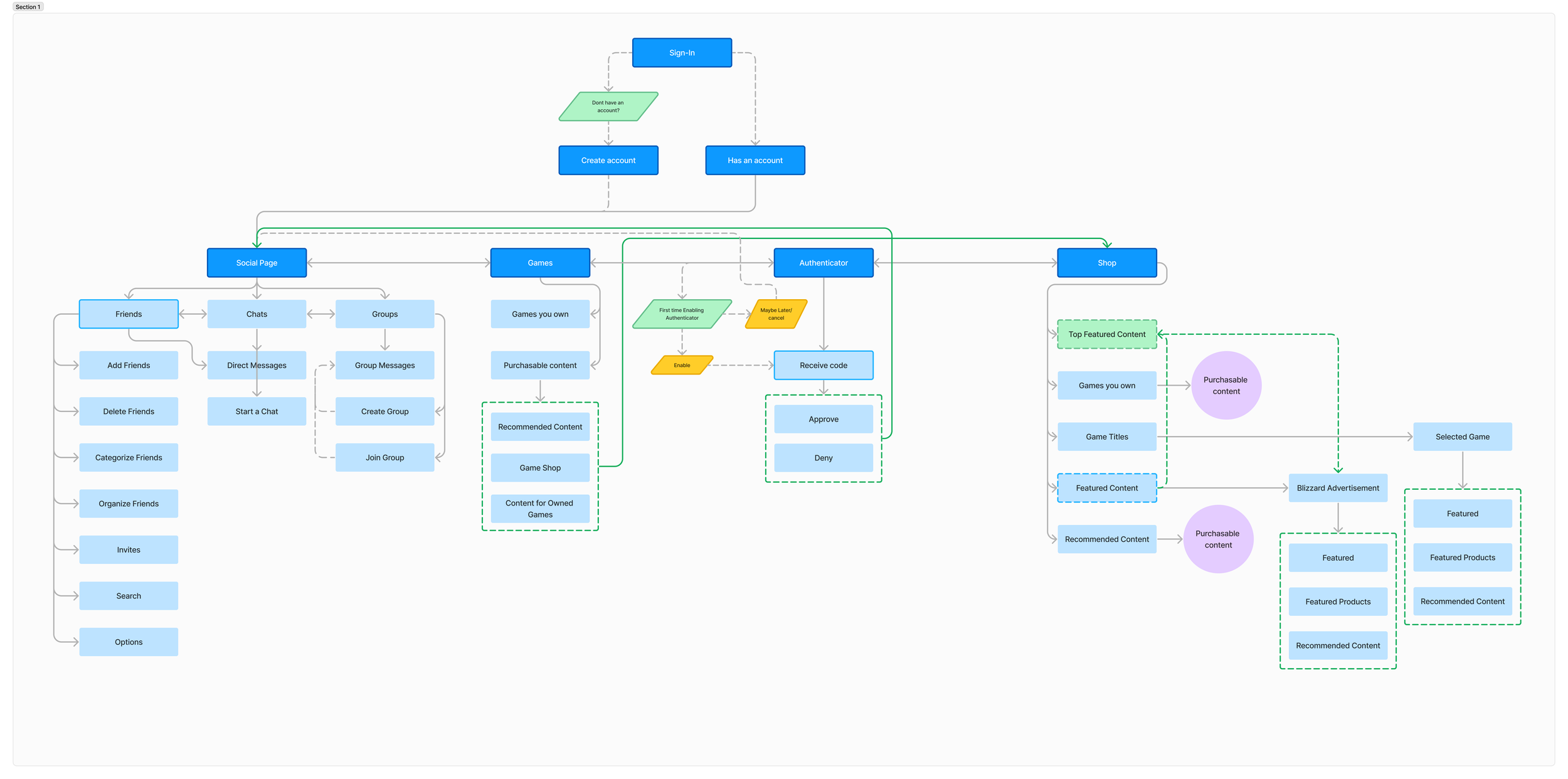
User Flow Map
Translating needs into features
From the touch points and needs gleamed from the empathizing phase, I created a Product User Flow Map to outline specific application features and organize the user flow, to better align specific user pain points, needs and wants when tackling the mobile Battlenet feature updates.
Design
Style Guide
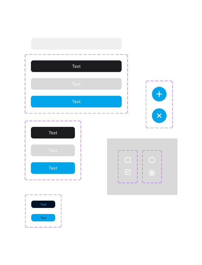
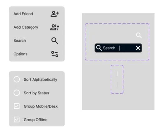
Light blues and dark blues were the primary colors that were already established by Blizzard Entertainment. Intern as the font for the main mobile app because of its readability at all sizes and iconography that was clear and self-explanatory. The branding stayed consistent with what the current mobile app has and what Blizzard Entertainment has already established.
Logos
Buttons
Color Palette

UI Iterations
As the designs evolved my mission was to make sure that all the designs kept in line with Blizzard Entertainment’s branding guidelines. Keeping the font, the color palette, sizing, avatars and likeness of the brand was a high priority. Based on the initial feedback of the wireframes, the goal was to make sure the designs translated affectively to the user and what each element was meant to convey. I refined the designs further and presented them to various individuals to get more user interactions and feedback. With this feedback I was able to create a cohesive design that bridged the gap between solving the main issues of the original product and maintaining the brand identity.
High Fidelity Designs

Being playful with UI design
While designing the mobile user interface, I wanted to make sure I followed the established Blizzard Entertainment brand, but I also wanted to make sure that I revitalized the look and feel by embracing a more organized, gaming atmosphere which felt more inviting.
This part of the process required research into what makes other applications personable, fun, organized and engaging within the gaming ecosystem. For this I looked at examples from Riot Games, Valve, Dribbble, Pinterest and Discord to see how designers approached their mobile design processes and inspiration.
“When you don’t have a lot of time to develop a product, you should just skip user testing.”
- Said no one ever
Showcasing Features & Testing
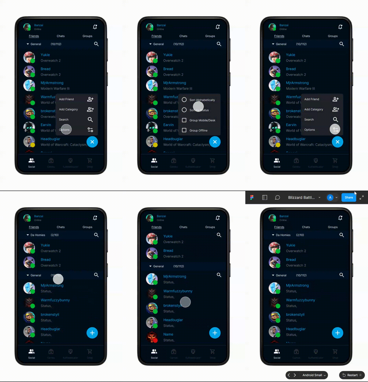
Social Page
The Social page has been updated to add categories which allows users to organize their friends.
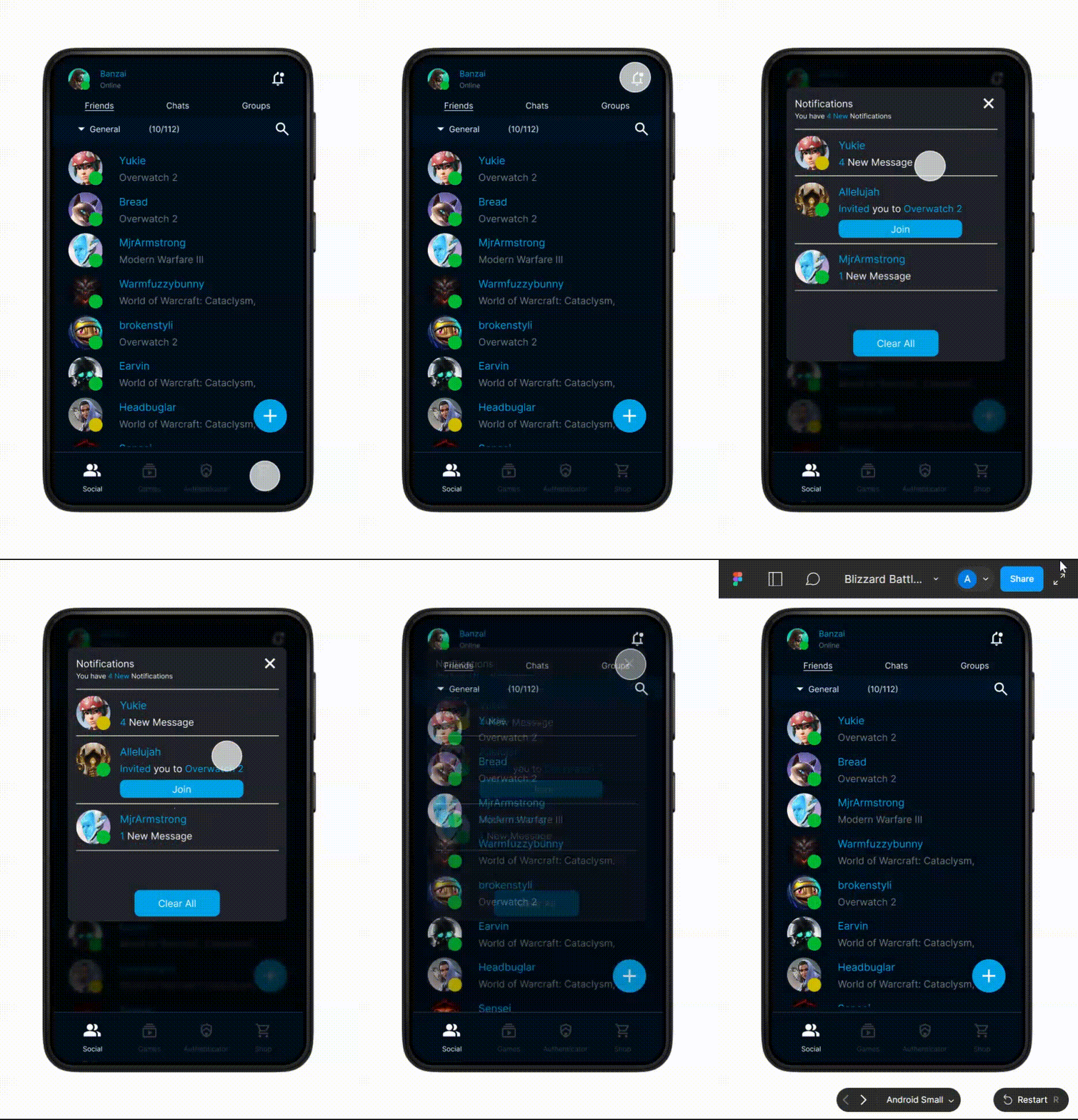
Notifications
A Notification bell has been added to the the top of the page to provide users with an easier way to interact with their desktop, friends, and games.
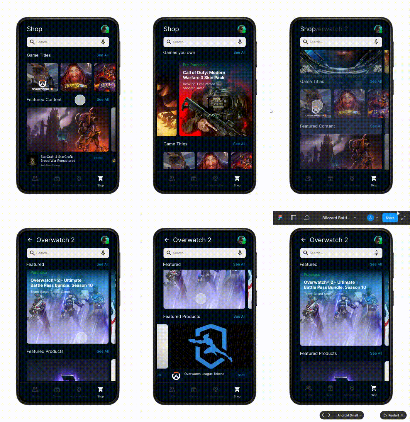
Shop
The Shop page have been completely revamped to match the users needs. The page will now match with what the user currently has in their game library and cater to their interests. It also has the capability to highlight specific promotions and new games coming out. This new key feature highlights what gamers need and want, which has the potential to increase revenue and user interaction.
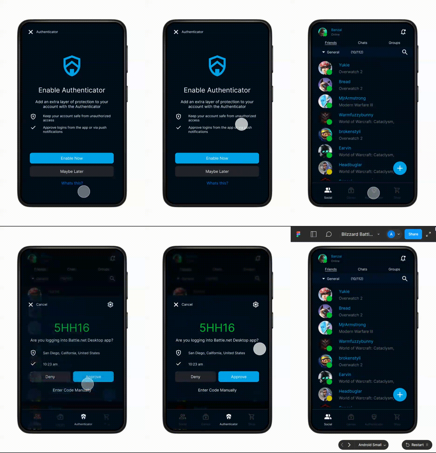
Authenticator
The Authenticator is now located on the bottom navigation bar, where it provides easier user access.
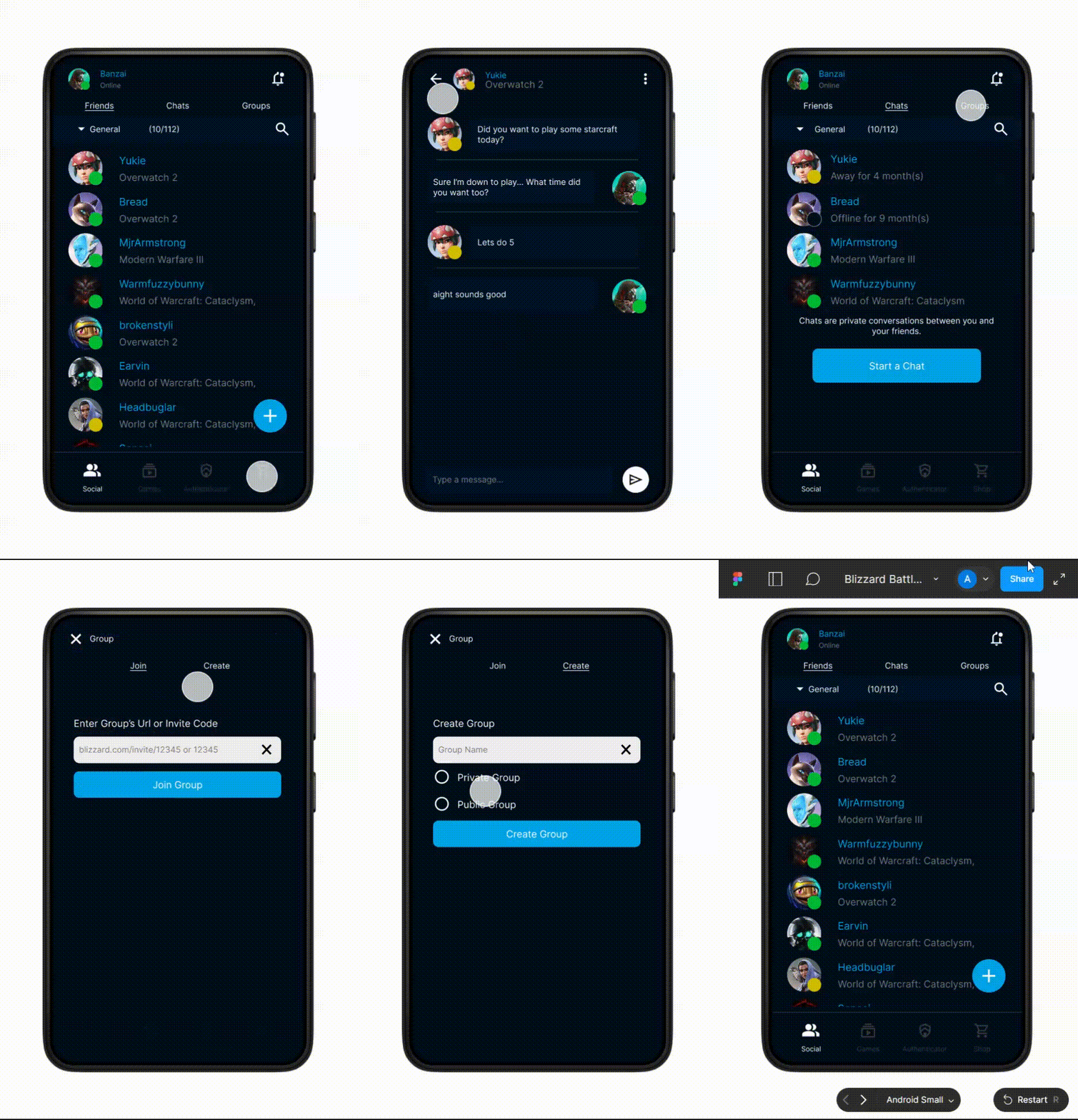
Direct Messages & Groups
Direct Messages are also part of the update. You can also create Groups within the mobile application, where as before you could only join.
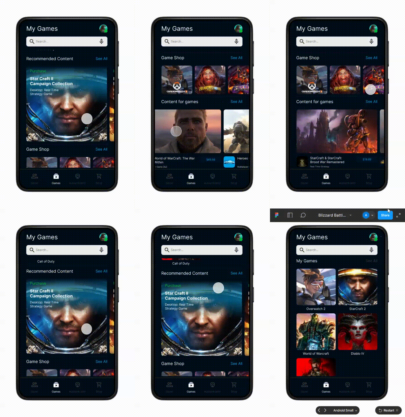
Games
The Games page has also been updated to showcase the games you own and what additional content is available for the games you own. You can shop for additional content, open the game on your desktop using the mobile app, as well as open a mobile game up (like Hearthstone) within the Battlenet library.
Reflection
Reflecting on the project
Following the first round of testing, the next steps would be to iterate and design for features beyond the current content.
Build out other shop features - All game content, cart UI, customizations and community social media sharing
Conduct second round of user testing to identify active usability issues
UI popup design for game activation in mobile to desktop
Project Takeaways
As a gamer, and a designer I had a particular affinity for this project and I would welcome the opportunity to further work on this project with Blizzard Entertainment to really bring these improvements to life. The gaming community is something that I call home and being able to redesign something that I’m passionate about really lent into how enjoyable the experience was.
Some key takeaways are:
Continue to iterate: As a UX Designer I would love to work on this even further, to refine the design, create animations, update more interactions and conduct user research on what else could be missing or enhanced.
My skill set grew: My understanding and skill set grew as I found that there are unique needs designing for a mobile gaming application. I also came to understand the needs of gamers and their specific user experience pain points when interacting with mobile applications.
Use existing patterns to decrease cognitive load. I loved the unique challenge of designing for this existing mobile app and helping to enhance the wants and needs of gamers. I was truly humble and appreciative to redesign an application from a professional juggernaut like Blizzard Entertainment..
While the updates don’t solve every pain point of the Battlenet mobile app, I feel as though I tackled the main problems and issues that is currently plaguing the app right now. With these new features and updates I believe this has the potential to increase user interaction and retention within Blizzard’s gaming community. Also, I strongly believe that these new features and updates can better the user experience and facilitate a healthy discussion that is sorely needed.
Lastly, I’ve come to the conclusion that Blizzard Entertainment should focus on enhancing key features with its mobile app, as I believe the mobile app has been completely forgotten and there is enormous potential that has yet to be explored (especially when BlizzCon comes about). The first steps in objective awareness often begins by bridging the gap between what your community needs and what Blizzard is capable of.